Why 90% of SaaS Onboarding Fails (And How to Fix Yours)
You spent months building your product. You wrote the landing page copy, set up the sign-up flow, and celebrated when users started registering. Then you checked your analytics and found that 70% of them never came back after the first session.
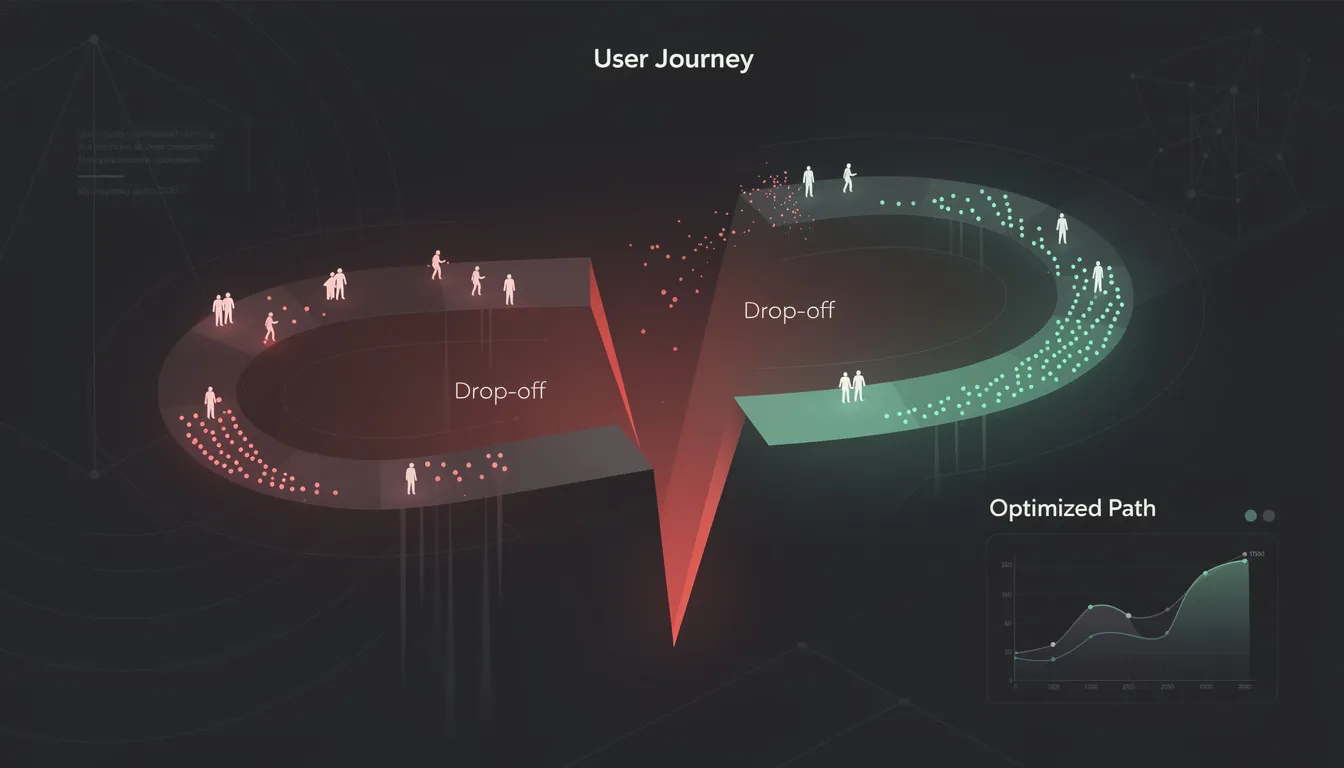
This is the silent killer of SaaS businesses. Not churn — abandonment. Users who signed up, looked around, got confused or bored, and left forever. Studies consistently show that between 60% and 80% of new signups never return after their first visit. The product wasn't bad. The onboarding was.
The good news: onboarding is a design problem. And design problems have solutions.
Why Onboarding Fails
The core failure in most SaaS onboarding is a gap between what the team assumes and what the user actually experiences.
Your team has lived with this product for months. You know every feature, every shortcut, every workflow. You've forgotten what it feels like to open the app for the first time with zero context. This is called the curse of knowledge — and it infects almost every onboarding flow ever built.
The second failure is structural over-engineering. Teams build elaborate multi-step wizards, video tutorials, interactive tooltips, and 12-step setup checklists — and bury the one thing the user came for. More features in onboarding rarely help. They add friction.
The third failure is misidentifying the "first moment." Most products force users to configure the tool before they can use it. The user wanted to experience value — instead they're filling out profile details and answering questions about their team size.
The 5 Most Common Onboarding Mistakes
1. Asking for Too Much Upfront
Every field you add to your sign-up or setup flow costs you users. Asking for company size, role, team count, and use case before someone has seen a single feature of your product is a bet against yourself. Most of that data can be collected progressively, after the user has experienced value. Start with the minimum: email, password, done.
2. No Progressive Disclosure
Showing every feature at once is overwhelming. Users need to be guided toward value in layers. The first session should unlock one core capability — not six. Progressive disclosure is the design principle of revealing complexity only when the user is ready for it. Most SaaS products skip this entirely.
3. Missing the "Aha Moment" Path
Every product has an aha moment — the instant when the user feels genuine value for the first time. For Slack it's the first real conversation. For Notion it's the first filled page. For Stripe it's the first successful test payment. Your job in onboarding is to engineer the shortest possible path to that moment. Most onboarding flows wander. They introduce settings, features, and tooltips instead of pulling the user toward the one thing that makes them stay.
4. Too Much Text, Not Enough Action
Modals full of explanatory text get dismissed. Nobody reads them. Users learn by doing, not by reading instructions. Every piece of onboarding text should be replaced with a guided action wherever possible. Instead of "This is where your projects live, click here to start", try a blank state with a single large button that says "Create your first project."
5. No Recovery Path for Confused Users
When a user gets stuck, what happens? In most products: nothing. There's no contextual help, no "start over" option, no human fallback. Confused users leave. A recovery path can be as simple as a persistent "Need help?" link, a guided setup prompt when the user has been inactive for 90 seconds, or an automatic onboarding email sequence that re-engages them with a clear next step.
The Fixes That Actually Work
The Minimum Viable Onboarding Checklist
Before building anything, answer these questions:
- What is the single most important thing a new user should do in their first session?
- What data do I actually need before they can reach that moment (vs. what I'd like to have)?
- What does success look like at the end of day 1, day 3, and day 7?
Strip your onboarding down to only what is required to reach the first aha moment. Everything else can come later. A checklist of 3 items that users complete is better than a checklist of 8 items they ignore.
Designing for the Aha Moment
Map your aha moment explicitly. Name it. Define the exact action the user takes that triggers it. Then count the number of steps between sign-up and that action. Every step you remove increases your activation rate.
For most B2B SaaS products, the aha moment requires the user to either (a) import or connect their existing data, or (b) complete a core workflow end-to-end. Design onboarding to make one of these happen within the first 5 minutes. Remove every step that does not serve this goal.
Empty State Design
The empty state is the most underrated moment in SaaS UX. When a new user first opens your dashboard, it's empty. Most products show a blank screen. This is a wasted opportunity.
An empty state should do three things: explain what this space is for, show what it looks like when populated (with a screenshot or illustration), and give the user a single action to fill it. Empty states that convert are direct, visual, and action-first.
How to Measure Whether Your Onboarding Works
Track these four metrics, in this order:
Activation rate — The percentage of new signups who complete your defined activation event (reaching the aha moment). Aim for 40%+ as a starting benchmark for B2B SaaS.
Time to activation — How long it takes from sign-up to the activation event. Shorter is better. If it's over 24 hours, you have a problem.
Day 1 retention — What percentage of users who signed up today are back tomorrow? This is your most honest signal of whether onboarding worked.
Funnel drop-off by step — Use product analytics (PostHog, Mixpanel, Amplitude) to see exactly where users abandon your onboarding flow. The drop-off point is usually where the fix is needed.
Once you have these numbers, run one change at a time. Reduce a required field. Improve your empty state. Move the aha moment two steps earlier. Measure the result. Iterate.
If you're looking at your activation numbers and know something is wrong but aren't sure where to start — that's exactly what a UX audit is for.
I'm Mehdi Yatrib, a product designer and UX consultant based in Casablanca. I run structured audits that identify exactly where your onboarding breaks down and deliver a prioritized list of fixes. No fluff, no generic recommendations.
Book a free UX audit call at yatrib.me — I'll tell you in 30 minutes what's costing you activation.
Written by Mehdi Yatrib — Indie Maker & Consultant based in Casablanca, Morocco.
Work with me on Product Design