How to Run a UX Audit That Actually Improves Conversions
Most conversion rate optimization advice focuses on A/B testing button colors and headline copy. Meanwhile, the product has a registration flow that takes 8 steps, an onboarding sequence nobody completes, and an interface so cluttered that users can't find the one feature they came for.
Fixing the design itself — not just the marketing layer on top of it — routinely doubles conversion rates. A UX audit is the structured process for figuring out exactly what to fix and in what order.
Here is how to run one that produces real results, not a list of vague recommendations.
What a UX Audit Actually Covers
A UX audit is not a subjective critique. It is a structured evaluation of a product's experience using three evidence types: behavioral data from analytics, expert heuristic evaluation, and user flow analysis.
The goal is a prioritized, evidence-backed list of issues ranked by severity and estimated impact. Every finding should include: what the problem is, where exactly it occurs, why it matters (what it costs you), and what the fix is.
A UX audit is not the same as user testing. User testing shows you what users do. A UX audit identifies what is causing those behaviors. You can run both — and you should — but they are different instruments.
Phase 1: Data Before Design
Never open Figma or the live product until you have looked at the data. The data tells you where to look. Without it, you are auditing by intuition.
Analytics review (GA4 or Plausible)
- Which pages have the highest exit rates?
- Where in the funnel do users drop off?
- What is the conversion rate at each step of the sign-up flow?
- What is the time-on-page for key content areas?
Heatmaps and click maps (Hotjar, Microsoft Clarity)
- What are users clicking that is not clickable?
- Are they scrolling past your primary CTA without engaging?
- Is attention concentrated where you want it, or scattered?
- On mobile, where are tap targets being missed?
Session recordings
- Watch 20–30 recordings of users who did NOT convert. Note every hesitation, rage click, and abandonment point.
- Watch 10–15 recordings of users who DID convert. What path did they take?
- Look for patterns. One confused user is an edge case. Seven confused users at the same step is a design problem.
Support tickets and chat logs
- What do users ask about most frequently? Repeated questions mean the interface failed to communicate something.
- What errors or frustrations appear most often?
Document your findings from this phase before moving to the evaluation.
Phase 2: Heuristic Evaluation
Jakob Nielsen's 10 usability heuristics are the most widely used framework for expert UX evaluation. Apply each one systematically to your product, and assign a severity score (0–4) to each issue you find.
The 10 heuristics:
- Visibility of system status — Does the user always know what is happening?
- Match between system and real world — Does the interface use language the user understands?
- User control and freedom — Can users undo actions and exit flows easily?
- Consistency and standards — Do similar elements behave the same way throughout?
- Error prevention — Does the design prevent mistakes before they happen?
- Recognition over recall — Is everything the user needs visible, not hidden in memory?
- Flexibility and efficiency — Are there shortcuts for experienced users?
- Aesthetic and minimalist design — Is everything on screen necessary?
- Help users recognize, diagnose, and recover from errors — Are error messages human and actionable?
- Help and documentation — Can users find answers without leaving the product?
Severity scoring:
- 0: Not a usability problem
- 1: Cosmetic only — fix if time allows
- 2: Minor — low priority
- 3: Major — important to fix
- 4: Catastrophic — must fix before launch
A full heuristic evaluation of a mid-complexity SaaS product typically produces 30–60 findings. Severity scoring is what makes this list actionable rather than overwhelming.
Phase 3: User Flow Analysis
Map every critical path in the product end-to-end. For a typical SaaS product:
- Sign-up flow
- Onboarding sequence
- Core feature activation
- Settings and configuration
- Upgrade/payment flow
- Error and empty states
For each flow, document:
- Every step the user must take
- Every decision point (where the user must choose something)
- Every drop-off point identified in your Phase 1 data
- Every dead end (what happens when the user does something unexpected?)
The user flow map does not need to be beautiful. It needs to be complete. Use whatever tool you are comfortable with — Figma, Miro, a spreadsheet, even a whiteboard photo.
Once the flow is mapped, ask these questions at every step:
- Is this step necessary, or can it be eliminated?
- Is the user's next action obvious?
- What happens if the user makes a mistake here?
- What does this step look like on mobile?
Phase 4: Copy and Clarity Review
UX is not just visual. Copy is interface. Review your product's text with the same rigor you apply to its layout.
Value proposition clarity
- Can a new visitor explain what your product does in one sentence after reading your homepage for 5 seconds?
- Does your onboarding copy communicate what happens next — or just describe what the product can do?
CTA wording
- Every button should tell the user what will happen when they click it. "Get started" tells the user nothing. "Create your first project" tells the user exactly what to expect.
- Review every CTA in your critical flows. Replace vague verbs with specific, action-oriented language.
Error messages
- Every error message should explain what went wrong in plain language, and tell the user what to do next.
- "An error occurred" is not an error message. "We couldn't save your changes — check your internet connection and try again" is.
Empty states
- Every empty state should tell the user what this space is for and give them a single action to fill it.
Turning Audit Findings Into Actionable Prioritization
At the end of the audit, you have a list of findings. Now you prioritize them using two axes: severity (how badly this hurts the user experience) and effort (how hard it is to fix).
This creates a 2x2:
- High severity, low effort: Fix immediately. These are your quick wins.
- High severity, high effort: Plan and resource these. They belong in the next sprint cycle.
- Low severity, low effort: Fix when you have time.
- Low severity, high effort: Defer or cut. These are not worth the investment yet.
Present your findings in a structured report with this prioritization visible. Every recommendation should link back to a specific finding and its evidence source (the data, the heuristic score, or the flow map).
What a Real UX Audit Deliverable Looks Like
A UX audit deliverable includes:
- Executive summary — The 3–5 highest-impact issues and their business implications
- Full findings log — Every issue, severity score, evidence source, and recommendation
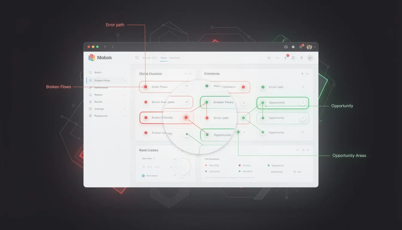
- Annotated screenshots — Visual callouts of specific problems in the product
- Prioritized roadmap — Issues organized by effort/impact quadrant with suggested sprint groupings
- Success metrics — How to measure improvement after fixes are implemented
The audit is not the end of the engagement. The value is in the implementation.
A UX audit is the fastest way to identify what is killing your conversion rate before you spend money on A/B testing or paid acquisition. Most products have 5–10 high-impact fixes that, addressed in sequence, produce significant measurable improvement.
I'm Mehdi Yatrib, a UX consultant based in Casablanca. I run structured UX audits for SaaS products and deliver prioritized, evidence-backed recommendations that your team can act on immediately.
Written by Mehdi Yatrib — Indie Maker & Consultant based in Casablanca, Morocco.
Work with me on Product Design