The Design System Checklist Every Product Team Needs in 2026
Most teams that build a design system end up with a beautiful Figma file that nobody looks at after six months. The components drift from the live product. Developers implement things from scratch because it's faster than wrestling with the system. Designers update the library and forget to notify anyone.
This is not a design problem. It's a process and prioritization problem. The teams that build design systems that actually get used do three things differently: they start smaller than they think they should, they obsess over the developer handoff experience, and they treat the system as a living product rather than a deliverable.
Here is the checklist they use — and the principles behind it.
What a Design System Actually Is (Not Just a Component Library)
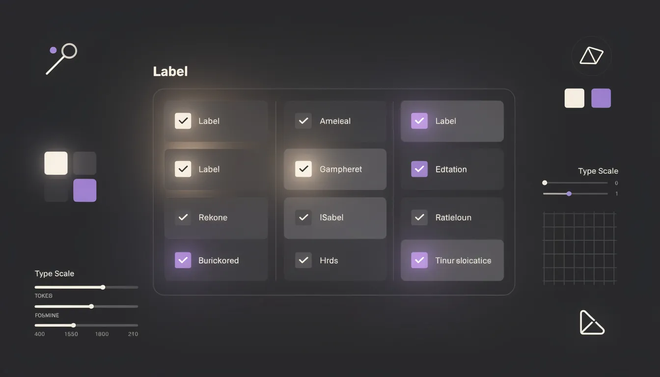
A design system is the combination of three things: design tokens (your visual primitives), components (the reusable UI pieces), and documentation (the rules governing how and when to use everything).
A component library is just the middle layer. It's the part that looks most impressive in a portfolio screenshot, so teams build it first. This is backwards.
Without tokens, your components are hard-coded with magic values that make them impossible to theme, update globally, or hand off clearly. Without documentation, your components get used incorrectly or ignored.
The checklist below covers all three layers, in the order you should build them.
The Checklist: What to Include
Foundation: Tokens
Design tokens are the atomic values that every component references. They are the single source of truth for your visual language. Define them first. Every downstream decision depends on them.
Color tokens
- Brand primary (and semantic variants: hover, active, disabled)
- Brand secondary
- Neutral scale (gray 50 through 950)
- Semantic colors: success, warning, error, info — each with surface, default, and foreground variants
- Background and surface tokens (page background, card surface, overlay)
Spacing tokens
- A consistent scale (4px base is most common: 4, 8, 12, 16, 24, 32, 48, 64, 96)
- Named as
space-1throughspace-24or equivalent - Do not use arbitrary pixel values in components — always reference a token
Typography tokens
- Font families (primary, mono if applicable)
- Type scale: display, heading levels (h1–h4), body large/regular/small, caption, label
- Font weights referenced by name (regular, medium, semibold, bold)
- Line heights and letter spacing per scale level
Border radius tokens
- A small set: none, sm, md, lg, full
- Applied consistently across components
Shadow tokens
- Elevation levels: sm (cards), md (dropdowns), lg (modals)
- Avoid one-off shadows in individual components
Core Components
These are the components that appear in every SaaS product. Build these before anything else.
Button
- Variants: primary, secondary, ghost, destructive, link
- Sizes: sm, md, lg
- States: default, hover, focus, active, disabled, loading
- With icon (leading and trailing), icon-only variant
Text input
- States: default, focused, filled, error, disabled, read-only
- With label, placeholder, helper text, error message
- With leading/trailing icon or adornment
Select / Dropdown
- Single and multi-select
- Search-within
- Group headers
- Clear option
Checkbox and Radio
- All states including indeterminate for checkbox
- Group layout (vertical and horizontal)
Toggle / Switch
- On, off, disabled states
- With label
Modal / Dialog
- Header, body, footer structure
- Sizes: sm, md, lg, fullscreen
- Close button behavior
Toast / Notification
- Types: success, error, warning, info
- With and without action button
- Auto-dismiss behavior
Badge and Tag
- Semantic colors
- Removable variant
Avatar
- With image, initials fallback, generic icon fallback
- Sizes and group/stack variant
Layout Components
Container — max-width wrapper with responsive padding Grid — responsive column grid with gap tokens Stack — vertical and horizontal spacing utility Divider — horizontal and vertical, with optional label
Pattern Library
Patterns are compositions of core components solving recurring design problems. They are harder to build but eliminate the most repeated work.
Form patterns — field groups, form layout, required/optional labeling, validation summary Table patterns — sortable columns, row selection, pagination, empty state, loading skeleton Empty states — with illustration slot, headline, body copy, primary action Loading states — skeleton screens (preferred over spinners for content-heavy views), progress indicators Confirmation dialogs — destructive action confirmation pattern with clear yes/cancel structure Page header — title, breadcrumb, description, action slot
Documentation
Documentation is what separates a design system from a collection of Figma frames.
For every component, write:
- Usage guidance — when to use this component, when not to
- Variant explanations — what each variant is for (not just what it looks like)
- Do / Don't examples — the most common misuse cases with visual examples
- Props and tokens — for developer handoff: every prop, its type, default value, and which token it maps to
- Accessibility notes — keyboard behavior, ARIA roles, minimum contrast requirements
What NOT to Include in V1
This is where most teams fail. They try to build everything before shipping anything.
Do not build:
- Every edge case variant before the base component is validated
- Chart and data visualization components (these are complex enough to be their own project)
- Marketing/landing page components (these belong in a separate marketing system)
- Highly custom one-off components before they've been used in at least two real product contexts
- Animation and motion system (token this later, after components are stable)
Ship a V1 system with foundation tokens, the core component set, and documentation. Everything else is V2.
Making It Developer-Friendly
A design system that developers can't implement efficiently won't be used. This means:
Figma variables over static styles. Use Figma's variable system to map your design tokens. When a developer inspects a component, they should see color/primary/default, not #4F46E5. Token names should match the code implementation exactly.
Auto-layout everywhere. Every component should be built with auto-layout so that resizing and state changes behave predictably. Components that don't resize correctly in Figma will not be trusted.
Naming conventions that match code. Your component names in Figma should match your component names in the codebase. Button/Primary/Large/Default in Figma should correspond to <Button variant="primary" size="lg" /> in code.
Explicit handoff specs. For every component, document padding values, spacing between elements, font size and weight, border values, and all state changes. Developers should not need to ask a designer what the hover state looks like.
Maintaining It Over Time
A design system that is not maintained becomes a liability. The way to maintain it is to treat it like a product.
Assign ownership. There should be a named person (or a named rotation) responsible for reviewing changes, updating documentation, and communicating updates to the team.
Version it. Every breaking change should be versioned. Teams using the system should know what changed and why.
Create a contribution process. When a designer builds something new that belongs in the system, there should be a clear process for proposing, reviewing, and merging it. Without this, the system falls behind the product.
Audit it quarterly. Every three months, review which components have drifted from the live product, which are not being used, and which new patterns have emerged that need to be codified.
Building a design system is one of the highest-leverage investments a product team can make. Done well, it cuts design-to-development time, eliminates visual inconsistencies, and accelerates the entire product cycle.
Done poorly, it's a Figma file nobody opens.
I'm Mehdi Yatrib, a product designer based in Casablanca. I help SaaS teams build design systems that their developers actually use — from token architecture through component documentation.
Written by Mehdi Yatrib — Indie Maker & Consultant based in Casablanca, Morocco.
Work with me on Product Design